Time to create your information product, filled with remarkable content for your ideal customer.
The resources provided here will introduce you to the principles of creating meaningful content that is readable and appealing.
All topped off with a sprinkling of style.
Creating an information product that is engaging, useful, unique, uses plain langauge as well as being both legible and readable, is key to delivering a product that sells.
Time to bring everything all together to create your information product. This is where the research, analysis, planning, organising and preparation steps you have completed at the previous stops along your product creation journey come in to play.
You have your plan and your resources are all lined up. You now just need to put your plan into action and leverage your preparation so that the product creation process is enjoyable without the overwhelm and stress.
At this stop, you will increase your chance of product creation success if you ...
Best Practices for Creating Meaningful Content
To create your information product you need meaningful content. That is a given. There are many views about the best practices for creating meaningful and relevant content. The UK Government provides a wide range of resources to help write well for your audience, including specialists.
The Digital Communications Division in the U.S. Department of Health and Human Services' (HHS) offers the following as a set of best practices.
Each piece of content should:
- Reflect your organisation’s goals and user’s needs
- Understand how users think and speak about a subject
- Communicate to people in a way that they understand
- Be useful
- Stay up-to-date and remain factual
- Be accessible to all people
- Be consistent
- Be able to be found
Stage 8 - Create Your Information Product
Write For Your Audience
It is essential that you write clearly so that your audience can:
- find what they need
- understand what they find
- use what they find to meet their needs
Whether you are writing a script for a video, audio or written presentation, use language that your audience understands and feels comfortable with. It is not about "dumbing down" your content. It is about writing based on your research to identify your 'ideal customer'.
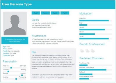
You focused closely on your audience's interests, expertise, pain points, desires and brought this all together when you created your Buyer Persona. Now is the time to put to use what you discovered to create your information product. Focus on creating your content with your audience top of mind. When you are unsure of which style of writing to use refer back to your Buyer Persona document as a guide.

Focus on What Your Audience Wants to Know
People today complain about being "time poor". They don't want to waste time or energy trying to wade through piles of information that is irrelevant to them. People only want to know what applies to them, how to take action quickly to achieve the results they're looking for.
So when you create your information product it is important to focus on what your audience wants to know about the topic covered by your solution. Guide them through the information they need to know and provide a clear 'call to action' so that they know what the next steps are. Highlight the important material. The US Federal Plain Language Guidelines suggest you ask yourself the following questions when writing for your audience.
- What does my audience already know about the subject?
- What does my audience need to know?
- What questions will my audience have?
- What’s the best outcome for my business (agency)? What do I need to say to get this outcome?
- What’s the best outcome for our audience? What do I need to say to get this outcome?
Use Plain Language for Improved Understanding
Plain language (also called plain English) is communication your audience can understand the first time they read or hear it. It also makes content accessible to people with disabilities, low-language proficiency and non-native English speakers.
Create your information product using plain language. Creating material using plain language means writing or presenting in a simple, straightforward way that is clearly understood by your audience. Your message will then not be lost in a sea of unnecessary and confusing words.
Plain language is clear, concise, and well-organised. Writers of plain language let their audience concentrate on the message instead of being distracted by the language they find difficult to understand.
"It is not baby talk, nor is it a simplified version of the English language. Writers of plain English let their audience concentrate on the message instead of being distracted by complicated language. They make sure that their audience understands the message easily."
Professor Robert Eagleson, Australia
Benefits of Using Plain Langauge
People don’t want to waste a lot of time “translating” difficult, wordy documents. Readers understand your documents more quickly when plain language is used. If you require your reader to follow specific instructions they are able to comply more accurately and quickly.
Other benefits include:
- gets your message across in the shortest time possible
- more people are able to understand your message
- less chance that your information will be misunderstood
- you save time and money with less customer followup and support required
Beware that language that is plain to one set of readers may not be plain to others. This is where understanding the common terminology and phrases used by your ideal customer is important.
What is the Difference Between Legibility and Readability?
Readability measures how much your reader wants to read your content.
Legibility measures your reader's ability to see the text.
Legibility
Legibility focuses on is how easy or difficult it is to see the differences between one letter and another. When you look at the text can you make sense of it? Are you able to recognise the individual characters easily?


Readability
Readability focuses on how easily words, phrases and blocks of text can be read. How appealing does the text appear to the reader? As an information content designer, you want to create a layout that invites your reader into the text.
The example below shows a block of text to the left 'before' it was reformated into a more readable format shown in the 'after' example displayed on the right.
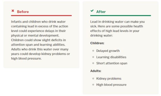

Legibility is only one component of readability. Create your information product with legibility and readability in mind. Whether you are creating content in printed form, a slide within a video or on a web page, a high level of readability is essential.
Create Readable and Appealing Content
Creating readable and appealing content is more than just information alone. It's about getting your audience the results they want. Appealing content is unique, helpful, engaging, organised and most of all relevant.
Readability is enhanced by the:
- content of the text (the information in it)
- tone of the text (casual, semi-formal, formal, instructional)
- format of the text (what it looks like to the reader)
- context (what the text is for)
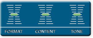
It is all about finding the right balance. It's a bit like tuning your sound system, where you tweak the controls until you find the right balance that appeals to you and your audience. Finding the right balance of content, tone, format and context also apply to content presented within a video or via audio.

You have already immersed yourself in your target market and identified your ideal customer so you should have a good understanding of what is relevant and helpful to them. Embracing the plain writing principles covered above will also help you communicate in a way your audience understands and resonates with. When you create your information product also make it highly useful, personal and ideally unique.
Make it highly useful. As an online entrepreneur, you want to make sure the content within your information product helps to solve a problem or gets your audience closer to their desired outcome. The content should be both informative and actionable. Present the information in a way that your audience can use it right away. Helping your audience achieve 'quick wins' builds trust in you and your product offerings.
Make it personal. Connect with your audience. Using storytelling to convey how you applied the content you are offering to your own situation or to that of a customer who achieved amazing results by using your solution. Remember that you have real hands-on experience you are able to share.
Use your research and analysis to help build authority but make sure you convey 'why should they care'. Your audience wants to know how the information relates to them in their context and how it can help them.
Make it unique. Do you have a new spin on an old idea? Are you able to substitute steps to make a process more effective? Are you able to combine your experience with aspects of your topic to make something more useful? Are you able to adapt a tool or concept and use it in a different situation? Perhaps you can put the components of your solution to a different use.
Take a look at your product offering and look closely at how you can magnify its uniqueness.
Organise Your Information
Utilise the design brief you prepared during the design stage. Depending on the type of design output you created earlier, use your table of contents or listing of topic headings as a guide. You may find once you populate your content the information flow will need to be tweaked to improve readability. Don't worry, it doesn't have to be perfect first time. The important thing to remember when you create your information product is that it needs to be presented in an organised manner.
Refer back to the research you undertook to establish your niche. Think through the questions your audience raised within community groups, forums or when you undertook customer interviews to uncover their pain points and desires.
How to Organise Your Information
- order your information in a logical sequence
- add descriptive headings to help people skim and scan the page
- use lists to break up text and to outline steps in a process
- use tables to make the complex material easier to understand
- break up information into manageable chunks with short sentences and short sections
- improve the flow, if something isn't easy to read, re-organise it
- use white space liberally to avoid dense walls of text
Choose Your Words Carefully
Don’t complicate things by using jargon, overly technical terms, or abbreviations that people won’t understand. We are not saying don't use jargon or technical terms at all. Just make your language as clear as possible keeping your intended audience top of mind.
When you create your information product choose your words carefully and be consistent in your writing style. If presenting your information via video or audio the same applies.
Use simple words and phrases. When you’re making word choices, pick the familiar or commonly used word over the unusual or obscure. Use the terminology that your audience is familiar with.
Be concise. Wordy, dense text within complex sentences is unappealing. Have you ever looked at a wall of text with minimal white space and felt a little overwhelmed? You can shorten and clarify complex material by using lists and tables. Using lists or tables also gives your document more white space, making it more appealing to the reader. Become more critical of your own writing and consider whether you need every word. Challenge every word—do you need it?
Use the same terms consistently. You will confuse your audience if you use different terms for the same concept or group. For example, if you use the term “senior citizens exercise group” continue to use the same term throughout your content. Don’t substitute another term, such as “the elderly” or “the aged.” Using a different term may cause reader confusion and decreases the clarity of your information.
Use examples. Provide relevant examples to help clarify complex concepts or to reinforce important points. Using examples is an ideal way to help your audience relate to your content. With examples, you are able to provide context easily and quickly. The more complex the concept you are writing about or presenting, the more you should consider using an example.
Use Emphasis and Styling to Improve Readability
Emphasis and styling are more than choosing pretty fonts and colours. We are creating an information product so our focus is on creating information that our audience can apply easily to solve their issue. The information needs to be easy to read so they can capture the important concepts that our solution provides them.
Emphasise Important Concepts
Adding bold, italics or underline can help to emphasise text but these should be used sparingly.
Use useful headings to emphasise important concepts or for logical grouping of key points of interest. Headings help your reader navigate your material whether it is written for print or for online media. Main headings are ideas or information central to your topic. They need to be clearly visible at first glance.
Subheadings, on the other hand, are minor topics that support or relate to the main points. They are not significant enough to stand as the main heading, but they are important enough to include so that they catch your readers’ attention.
Try using a variety of types of headings were appropriate.
Question Headings
You already know from your research the types of questions your audience asks, use them as headings. Question headings are also useful within instruction or troubleshooting guides. You will have seen them used in action within FAQ (frequently asked question) web pages.
Using a question-and-answer format helps your audience scan your content to locate the specific information they want. Question headings can also be used to expand your reader's knowledge of your topic.
Examples:
Why use question headings?
What is the difference between a digital product and a physical product?
Statement Headings
Statement headings are very specific, promote a call to action or express a fact or an opinion. They signal that the content following them will provide supporting details.
Example: Using Emphasis and Styling Improves Readability
Topic Headings
A topic heading consists of a single word or short phrase that serves as a label for the content that follows.
Example: Road Map
Styling for Legibility
We need to help our audience to get the outcome they want by applying our solution. When you create your information product it must be logically structured and information formatted in a way that makes it easy to understand and apply. We must ensure that our font choice is legible and the text within our content is readable. If your fonts are too complicated, they can detract from your message.
Serif vs Sans Serif Fonts
Serifs are the tiny strokes or 'feet' at the end of a letter’s main strokes.
Sans Serif fonts don't have the extra stokes. Sans is French for “without.”
Serif fonts vary the thickness of the letter strokes more than sans serifs. Sans serif fonts have more uniform lines.


The argument continues whether sans serifs are easier to read than serif fonts. However, sans serif fonts are 'generally' considered easier to read because their letter shapes are simpler and therefore slightly more legible than serif fonts.
What are Web Safe Fonts?
Web-safe fonts are fonts that are pre-installed by many operating systems.
There are a huge number of fonts available online with designers creating more every day. When you compare printed material to online web pages, have you noticed that web pages display fewer fonts styles?
When a web page is loaded the browser is instructed to display a specific font which is stored on your computer. If the computer doesn't have the font requested, rather than displaying nothing, a default font is displayed instead. The font you see may not be the one originally intended. The visitor has no idea this has happened.
The problem is Windows and Mac OS X, the most widely-used operating systems, use a different set of default fonts. To add another level of complexity, mobile devices like Android and Apple have default font sets as well. You guessed it, not all the same.
There is a small collection of fonts that overlap from Windows, to Mac, to Google - 'web safe fonts'. If in doubt use these:
Arial
Courier New
Georgia
Times New Roman
Verdana
Choose Your Fonts Carefully
It's not just a matter of choosing the right font, but also what we do with it. Fonts can be used to convey emotions and personality. Are you after a font that is traditional vs contemporary or warm vs cool?
When applying different fonts, colour and size to your text, you can dramatically change the way your message is received. By using different weights (bold, regular, light) and styles (italics, condensed) you have different variations available when using the same font. It is useful to work with fonts that come from a larger family with an extended set of style options.
Remember, when you create your information product keep the nature of your content and your target audience in mind. Your audience has a limited number of standard fonts installed on their computers. So if you want your fun, crazy, creative font to show up exactly as you designed it on all systems worldwide, you may be out of luck. Save them for your printed material instead.
Tips for the use of Fonts and Bullet Points
Fonts
- don’t mix fonts within the body of your text
- don’t use more than one or two font families
- avoid tiny font sizes
- select simple, readable fonts
Bullets
- use standard bullets styles
- be consistent in your use of bullets throughout your content
- don’t use more than two types of bullets on a page
- use numbers only when there is an ordered list or sequence
